KEYWORDS: why is responsive web design important what is responsive web design responsive web design seo benefits of responsive web design Boost SEO with Responsive Design Importance of Responsive Design
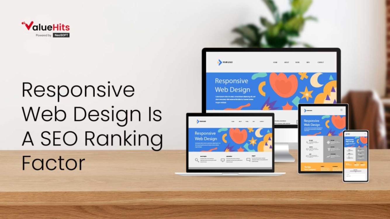
Responsive Web Design Is A SEO Ranking Factor
A couple of years ago, Google updated its ranking algorithm and included web design responsiveness a parameter for SEO rankings. If you didn't know this then maybe you were living under a rock. Mobile configuration holds a bright future for the SEO and the digital marketing world. User-friendly websites, with easy navigation features and optimum responsiveness, gets more clicks and conversion rate.
What Is Responsive Web Design?
In simple words, responsive web design means a website configured to look proper and perform efficiently on every desktop as well as mobile devices. Businesses need to see this from a technical perspective and set up their websites correctly and make it fully responsive for every device. This means that regardless of the device you use to access a particular link, the website will rescale to fit the size of the device you use.
How Is It Beneficial For SEO Ranking?
With the increase in data consumption through mobile devices, your focus should be more on designing responsive websites as the advantage is directly associated with your SEO ranking. Take a look at some of the Search Engine Optimization benefits of a responsive web design.
Google Says So
If Google has said it then you have to do it. It's all about search engine ranking and if a search engine giant recommends website configuration then it's best to do it because ultimately, your search engine results determine your SEO success rate.
Lowers Bounce Rate
Who wants to waste their time on a sloppy website? We've all done it. Closed a website and moved on to another one to fetch the data we're looking for. This increases bounce rate, which affects your SEO. Google uses bounce rate as an element to determine customer satisfaction and if users are leaving your websites in a few seconds or not visiting any other page, your bounce rate will increase and Google will drop your search engine ranking for that specific keyword.
With responsive web design, your users can have a good time at your website and may also end up buying your services. Satisfied customers mean a positive outlook for Google leading to improved SEO ranking.
One URL For All
No redirects, the website adjusts to your screen size and provides a proper looking website. With that, you don't have to create another URL for the mobile site, saving you cost and time as you only need to perform configuration. Moreover, this also eliminates duplicate content given the URLs are same and simply modified to the m. version. So a mobile-optimized website can keep you from getting penalized by Google for creating duplicate content.
Easy Promotion
As you have an optimized website for both desktop and mobile devices, you don't have to work on two different sites but one. For instance, if you create two URLs for your website, you'll have to do SEO for both websites and the results may vary as well. But with a responsive web design, you promote the website as one, which enables you to work effectively.
PMax Campaign Strategies for Dental Clinic
June 29, 2026
Running a busy dental office means you want new patients walking through your door every day.
Short-Form Videos Strategy: How Brands Can Win Attention in 2026
June 26, 2026
Short videos are proven to be one of the most effective media across the advertising domains.
Pinterest Ad Updates 2026 For Campaign Managers
June 19, 2026
Pinterest has evolved far beyond just a visual inspiration platform today, because i

Hardik Mody
Senior Manager - Digital Marketing atValueHits
Hardik Mody is a Senior Manager in Digital Marketing. He plans and coordinates the marketing activities of ValueHits, a full-service Digital Marketing Agency in Mumbai, India. With his experience and Expert knowledge in the field, he identifies potential customers and develops marketing campaigns. Also, he is efficient enough to meet the client’s requirements and well-organized in handling multiple tasks.